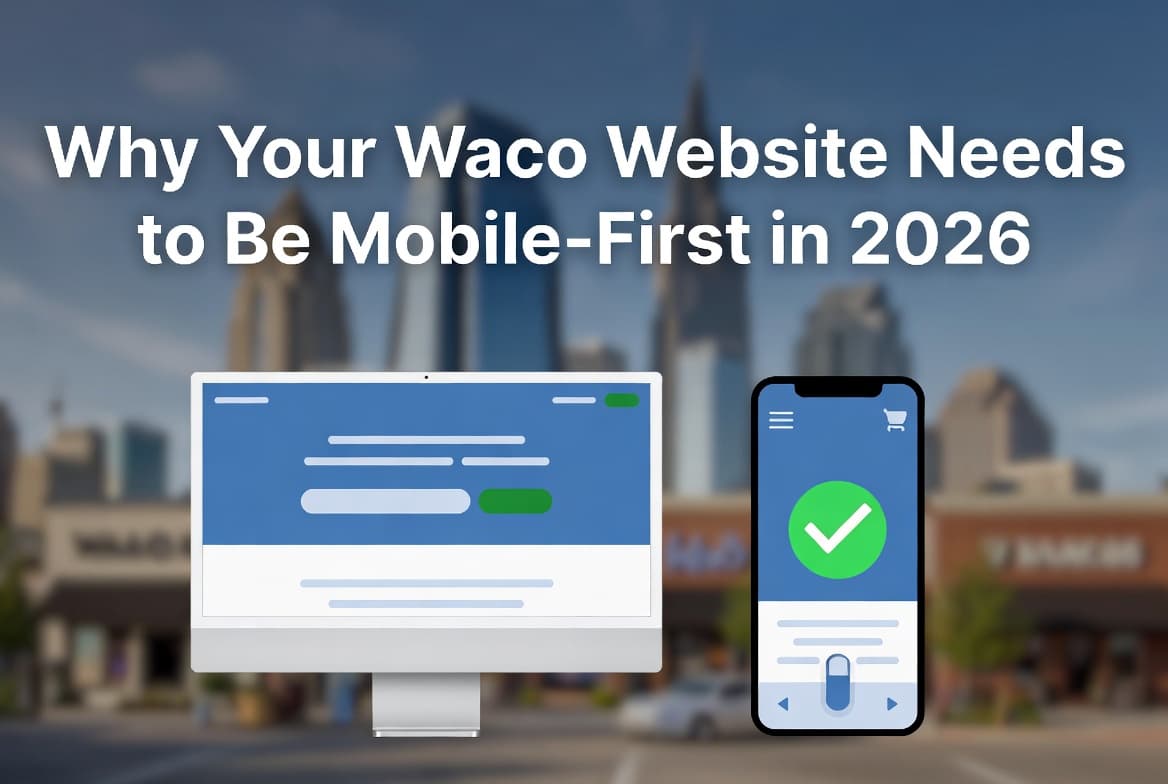
Why Your Waco Website Needs to Be Mobile-First in 2026
Most of your customers are searching on phones. Here's why mobile design is no longer optional for Waco businesses.
The Numbers Don't Lie
More than 72% of all local search traffic in the US is now on mobile devices. In a city like Waco — where a huge portion of customers are searching for businesses while commuting on I-35, at lunch on Baylor's campus, or in the evenings from home in Hewitt or Woodway — that number is probably even higher for your business. If your website doesn't perform on mobile, you're functionally invisible to the majority of people in McLennan County looking for what you offer.
Google switched to mobile-first indexing in 2023. This means Google crawls and ranks the mobile version of your site — not the desktop version. A site that's great on desktop but poor on mobile will rank poorly for Waco searches across all devices.
Six Ways a Non-Mobile-First Site Costs Your Waco Business Money
Lower Google Rankings
Mobile-first indexing means your mobile performance directly determines your position for Waco-area searches — for all users, even those on desktop.
Slower Load Times
Sites built desktop-first and scaled down are typically bloated with oversized images and unused CSS that tanks mobile speed — and patience runs short in Waco.
High Bounce Rates
Users on mobile will leave a site within 3 seconds if it doesn't load correctly. Google registers that bounce as a quality signal and demotes your Waco rankings.
Broken Layouts
Desktop layouts forced onto small screens create overlapping text, broken navigation, and images that bleed off screen — all of which kill trust with local customers.
Failed Core Web Vitals
LCP, CLS, and INP are measured on mobile. Failing these metrics directly suppresses your rankings for Waco, Hewitt, Woodway, and Temple area searches.
Lost Trust
A site that looks broken or outdated on a phone signals to potential customers in Bellmead, Robinson, or anywhere in Central Texas that your business might be too.
Desktop-First vs. Mobile-First: The Real Difference
| Factor | Desktop-First | Mobile-First |
|---|---|---|
| Starting screen size | 1440px wide | 375px wide |
| CSS approach | Scale down with breakpoints | Scale up with breakpoints |
| Image sizing | Large, optimized later | Compressed from the start |
| Navigation | Complex menus → hamburger | Thumb-friendly from day one |
| Google ranking signal | Mobile version evaluated | Mobile version evaluated |
| Performance baseline | Desktop fast, mobile slow | Fast on both |
Test Your Waco Business Site Right Now
- Pull up your website on your own phone — not the desktop preview in Chrome DevTools, your actual phone on 4G or 5G.
- Time how long before you can tap a button or read text. If it's over 3 seconds, you're losing Central Texas customers.
- Run your site through Google's PageSpeed Insights (pagespeed.web.dev) — check the mobile score specifically.
- Try tapping your navigation menu, phone number, and primary CTA button on mobile. Do they all work cleanly without mis-tapping?
- Check if your images are properly compressed — a 4MB hero image on mobile will single-handedly destroy your load time and your Waco Google rankings.
- Search your business name on Google from your phone and check how your listing and site appear in the results.
What a Mobile-First Redesign Actually Involves for a Waco Business
A proper mobile-first build isn't just making your current site "responsive." It means rethinking layout hierarchy, navigation patterns, typography sizes, button sizes, and image compression from the smallest screen up. It also means building performance budgets into the project from day one — not as an afterthought. The result is a site that's typically faster on all devices, not just mobile. We've done this for businesses across Waco, Hewitt, Woodway, Temple, Killeen, and the broader Central Texas region — and the impact on both rankings and conversions is consistently significant.
See what a mobile-first Waco website looks like in practice: scottapplications.com/services/website-design/waco-tx — Next.js builds that score 90+ on PageSpeed, starting at 375px, local SEO built in.
Frequently Asked Questions About Mobile Web Design in Waco
- Is my current site mobile-friendly? The quickest test: load it on your own phone on cell data. If anything looks off, overlaps, or loads slowly — it needs work.
- Will a mobile-first redesign help my Google rankings in Waco? Yes, directly. Google uses your mobile site's performance as its primary ranking signal for all searches, including local Waco searches.
- How much does a mobile-first website redesign cost? Most small business redesigns in the Waco area run $2,500–$7,000 depending on content, pages, and features required.
- Can you fix just the mobile issues without a full redesign? Sometimes — it depends on how your current site is built. We'll audit it and give you an honest answer on whether a targeted fix or a full rebuild makes more sense.
- How long does a mobile-first redesign take? Typically 4–8 weeks for a standard business site. We work with Waco-area businesses throughout the process to make sure it represents your brand accurately.
Related Reading
Is Your Site Losing You Mobile Customers in Waco?
We build mobile-first websites for Waco and Central Texas businesses that load fast and rank well. See our Waco web design services at scottapplications.com/services/website-design/waco-tx.
See Waco Web Design Services